What's new in upcoming WCAG 2.2
Part 1: Focus Indicators

Background
About WCAG
A new draft of WCAG 2.2 was released on January 25th, 2023, with the completed publish date for the version set for April of 2023. WCAG 2.2 will be the next release of the Web Content Accessibility Guidelines (WCAG) by the World Wide Web Consortium (W3C), an international community (on its way to becoming a public-interest non-profit) that “develops open standards to ensure the long-term growth of the Web.”
The guidelines aim to ensure that digital content, especially web content, is more accessible to a wider range of people, including those with disabilities. It is important to note that “content” in this context refers to more than text and encompasses many other aspects of a user interface. You can learn more about WCAG and the W3C at the links provided.
Why WCAG is important
For those working in user experience (UX) and tech, WCAG provides direction and testable success criteria to create and measure digital interfaces that are accessible or at least strive for accessibility.
WCAG is also used as the legal standard by much of the world. Once WCAG 2.2 is officially released, it will take some time for countries to adopt them into law with the EU being likely to embrace it first. Currently, the European Union (EU) sets WCAG 2.1 as their official, legal accessibility requirement. Many other countries like Australia, Canada, and the U.S. set WCAG 2.0 AA conformance as a legal requirement for government or government-funded websites and web applications while highly advising conformance by the private sector. Anti-description laws in those countries provide a means for people with disabilities to take legal action against companies not providing equal access to digital services and spaces. WCAG Level AA is frequently cited in those lawsuits.
Aside from the legal risk, creating user interfaces (UIs) that strive for accessibility so that everyone is equally supported is a UX and ethical best practice. Creating more accessible UIs has also proven to enhance the user experience for all users, elevate brand perception, and drive innovation.
Each WCAG release builds on the last, meaning every guideline from earlier releases is included in WCAG 2.2 with some new additions. This article is the first of a two-part series that looks at these additions, what they mean, and how to meet them as UX and development practitioners.
What's new in WCAG 2.2
Focus Indicators
Three of the new WCAG success criteria deal with focus indicators. Focus indicators or focus states are visual signals that serve the same purpose for keyboard users as a cursor does for mouse users. It shows the user where they are on a screen and what elements (e.g., a button, hyperlink text, etc.) they can interact with, essentially becoming the tool with which that user navigates a website or application and its content.
The new WCAG success criteria related to focus indicators include:
- SC 2.4.11 Focus Not Obscured (Minimum) (Level AA)
- SC 2.4.12 Focus Not Obscured (Enhanced) (Level AAA)
- SC 2.4.13 Focus Appearance (Level AA)
It should be noted that at a minimum, UIs should aim for Level AA conformance, meaning that any success criteria categorized as Level A and Level AA need to be met. Level AAA conformance is not required but ensures the highest level of accessibility based on the guidance. Limina recommends using a research-driven approach to determine whether Level AA or Level AAA success criteria conformance is the most appropriate for your audiences. That said, this article series will break down all new success criteria no matter the level.
Next, let’s break down the requirements to meet each of these criteria.
Focus states or focus indicators are not only required to meet Web Content Accessibility Guidelines (WCAG) conformance, but more importantly, they provide a better experience for all users, especially those using keyboards over a mouse to interact with an interface.
SC 2.4.13 Focus Appearance (Level AA)
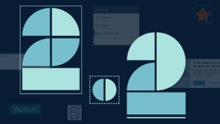
Option one: solidly enclose elements in an outline (recommended)
Outlines work better than borders or background state changes for focus indicators because outlines have little impact on the element itself and should not affect the element’s layout (e.g., the outline appearing should not cause the element to shift on the screen).
The easiest way to meet this success criteria is for the focus indicator to be a solid outline of at least 1px solid, though 2px solid to 4px solid is recommended. The outline needs to enclose the element that is on focus completely. Dashed lines are not considered a solid bound and would need to meet a minimum area total mentioned in the other options.
There are two ways to solidly and completely enclose the focused element. The element can be bound (the outline follows the smallest possible rectangle bounding an element) or the element can be surrounded (the outline follows the shape of the element itself).
In most cases, bounding is the best and easiest option, both in design and development.
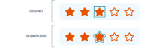
Bound is shown as a blue solid box outline around an orange star.
Surround is shown as a blue solid line that traces around the shape of an orange star. In both cases, the lines do not touch the star.
Option two: create an indicator as large as the element's parameter
Another way to meet this success criterion is to create a focus indicator that is at least as large as the element’s parameter if that parameter is 1 pixel thick. This approach requires some math but does allow for more flexibility in the visual aesthetic of the focus indicator.
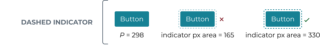
For instance, the indicator could be positioned around a sub-element within the element if it met the area requirements. Or the indicator could be dashed, but the total pixels would still need to meet the area requirements.
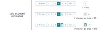
Sub-element indicator: a pagination element is shown where the user is focused on page 5.
One example shows a bound box around the number 5 but the line is too thin.
Another example shows the bounding line thicker, which does meet the success criteria.
Dashed indicator: One button example has a dashed focus indicator, but it is only 1 pixel wide and thus does not meet the success criteria.
Another button example shows a thicker dashed line indicator which does meet the success criteria.
Option three: create a 4-pixel thick indicator as large as the element's shortest side
Another option is to create a focus indicator that is at least as large as the element’s shortest side but is a minimum of 4 pixels thick. Again, this approach requires some math but allows for more flexibility.
This option could be used for elements like local navigation, or wide list items that could benefit from an indicator that does not span the full width of the content body.
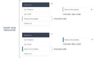
Short side indicator: a local vertical navigation component is shown with one page on focus.
The example showing a 3px bar to the left of the nav item does not meet the success criteria.
The example showing an 8px wide bar to the left of the nav item does meet the criteria.
Meet color contrast ratio of 3:1
No matter which option or combination of options you choose to use, the focus indicator must have a contrast ratio of at least 3:1 with both the elements it touches and the background it is against. This is not a new success criteria. It was actually part of WCAG 2.1 (SC 1.4.11 Non-text contrast level AA).
It is very difficult to choose a focus indicator color that has enough contrast with both the interactive element and the background that element is on, especially since the interactive element itself must have a minimum contrast ratio of 3:1 with the background. For that reason, Limina suggests leaving space between the focus indicator and the element that is focused. In that situation, the focus indicator only needs to meet minimum contrast with the background. This space can often be implemented using outline-offset
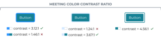
Meeting color contrast: The first button has a focus indicator that is a blue bound that meets contrast with the background but not the button.
The second is a light blue bound that meets contrast with the cyan button but not the background.
The last example is a teal bound that is not touching the button, and thus only needs to meet the contrast with the background. This example has enough contrast and meets success criteria.
SC 2.4.11 Focus Not Obscured (Minimum) (Level AA)
This success criteria states that on-focus elements cannot be entirely obscured by other content on the screen. This criteria often comes up in relation to sticky nav, sticky headers, or non-modal dialogs (dialogs that the user can ignore and continue site activity around).
For example, if a keyboard user is tabbing through a page and there is a sticky nav or header that is following them as they move down the screen, that sticky element cannot obscure the currently focused element. This can also happen with a screen when zoomed or enlarged via the browser, meaning, focused content cannot become obscured when the user increases the size of the elements on the screen, even when it causes the content to reflow.
The easiest way to meet this criteria is to avoid sticky or floating content. However, that may not be realistic and sticky elements can improve the user experience when applied optimally. In the cases where there are sticky or floating elements (e.g., chatbot, feedback button, back-to-top button, etc.) testing will need to be done to ensure those elements never completely obscure the element that is on focus. One such test is to manually tab through all the screen content looking for this issue.
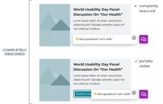
Completely obscured: Sticky elements like a chatbot button and the associated message is large enough that they can completely cover page content like a card or button. In those cases, the user cannot see what is on focus.
If the chatbot prompt was moved or shortened, some of the button behind it can still be seen, meeting level AA for this criteria.
Note that draggable elements do not count unless they load in a manner that entirely obscures an element that is on focus. If the user moves a draggable element to a place on the screen that entirely obscures a focused element, that is not considered a failure of the criteria.
SC 2.4.12 Focus Not Obscured (Enhanced) (Level AAA)
This success criteria is very similar to the minimum found in SC 2.4.12 (Level AA), however, for Level AAA it is required that no part of the on-focus element can be obscured. If any part of the focused element is obscured, it is considered to have failed the success criteria.
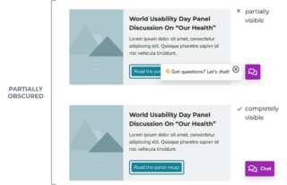
Sticky elements like a chatbot button and message can cause interactive page content like a card or button to be obscured. That means the user can no longer completely see the element or if it is currently focused on.
Removing the chatbot prompt and keeping the chatbot button outside of the main page content would solve the issue and meet level AAA for this criteria.
Built-in browser focus indicators
Most browsers provide built-in focus indicators for native interactive elements, so it can be tempting to simply rely on their out–of–the–box focus capabilities. However, these built-in indicators may not meet WCAG conformance. Depending on other aspects of the UI’s design, the browser’s focus indicators may not always have enough contrast with the background colors chosen. Browser focus indicators also may not work well with more complex components or meet the minimum area required if dashed.
Browser-based focus indicators can be a good place to start, but do not assume that all browsers will automatically meet WCAG conformance.
To recap
The easiest way to meet the focus indicator success criteria in the currently released WCAGs and coming out in WCAG 2.2 is to:
- Not assume focus indicators built into browsers will automatically conform to WCAG
- Use a 2-4px thick outline that bounds the element that is on-focus
- Position the outline so it does not actually touch the element that is on-focus, instead have it sit a few pixels outside of the element
- Ensure the focus indicator always has a minimum of a 3:1 contrast ratio with the background
- Test that no components in the UI (especially those that are sticky) obscure any of the elements that can be focused on
We hope this article was helpful in understanding the upcoming new success criteria for focus indicators. As mentioned, this information is based on the latest released draft by the W3C, so WCAG 2.2 content may change with the final release.
We’re interested in hearing your thoughts about WCAG 2.2 and focus indicators. Please join us for part two in this article series where we look at the other success criteria of WCAG 2.2.
What to read next
Medical applications look to UX for successful adoption by an aging population
Designing an application that aims to help older patients track their joint and osteoporosis pain