Medical applications look to UX for successful adoption by an aging population
by Ellie Krysl
[Author’s note: We started this project and wrote this post long before COVID-19 became a global crisis. However, what we’ve come to realize through the societal challenges we’re facing with social distancing and revised medical practice policies, this solution could not be more timely. With that, we’ll share our post with you.]
How can you design an application and user experience for older users, who may not be as familiar with technology, to help them make medical decisions?
At Limina, we’re currently working on a UX project with a spine surgeon who is designing an application that aims to help older patients track their joint and osteoporosis pain. The feedback the application receives can then empower the user, allowing them to make more informed decisions about their health.
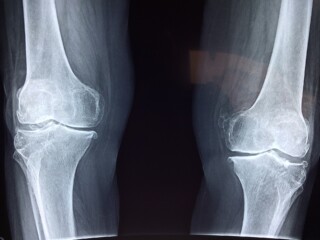
Dr. Sohail Mirza is a nationally known orthopaedic surgeon who specializes in treating complex spinal diseases, cancers, and injuries. In addition to his clinical work, he is also an active researcher, studying treatments for spinal trauma and cervical spine malformations, as well as safety and outcomes data for common back surgeries. In this introduction to a lecture on osteoarthritis at the Dartmouth-Hitchcock Medical Center, Dr. Mirza explains that arthritis just means inflammation and it is a lifelong condition with no cure in terms of eliminating it or reversing it. Osteoarthritis is commonly associated with aging and is common in the hip, knee, shoulder, and ankle joints. He suggests the best way to treat osteoarthritis is to educate patients about the process and empower them with things they can do on their own to minimize pain and the limitation of function, using surgery as a last resort.
Dr. Mirza had been asking his patients to utilize a desktop, web-based test to get information on pain and joint function, but they were having trouble using it — citing that it was confusing and cumbersome. He recognized there were issues with the test’s user experience, so he approached Limina for an expert UX eval and product redesign.
Using technology to empower patient decision-making
The primary focus of this application is to have people evaluate and track their pain and function of their knee and hip joints in order to make an informed decision about treatment or potential surgery. Dr. Mirza’s eventual goal is to have the application encompass osteoporosis in all joints, however, the initial focus of the minimal viable product (MVP) to specifically look at knee pain and following a workflow from beginning to end.
Empowering patients means providing them with big picture information including where they actually sit in the context of other people their age dealing with similar types of pain. Physicians have a bigger picture because they see patients with the same sort of issues over and over, but patients don’t necessarily have that perspective.
In addition, the appointment time with a doctor is usually so short that many patients may not have a chance to have in-depth conversations and ask all the questions they’d like to. With the information tracked in an application like Dr. Mirza’s, the patient and doctor both go into an appointment with a strong baseline understanding which allows the conversation to start at a much higher level.
Surprising testing results with an older population
We started with an expert UX eval, which is a common first exercise with clients who have existing products. Within an expert eval, we are looking for where UX best practices are not being met, and what could be causing usability issues. We then worked with Dr. Mirza to prototype a new user experience aimed at hitting the goals we identified to produce a more intuitive application.
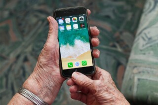
When we conducted a usability study of the prototype, the test revealed that a mobile application would be much more effective.
For testing the redesigned application (now mobile) we originally believed a one-on-one, in-person, moderated usability test would be the best fit for this product and audience. We were wrong. Due to multiple factors, an in-person usability test was just not realistic or feasible for this demographic. While we did gather some useful data from one-on-one, remote usability tests, it was the crowd-sourced, remote, unmoderated usability test that received the greatest amount of participation and data.
Originally we were concerned that there wouldn’t be enough people in the pool that were over 65, had knee pain, and might be interested in a product like this. Turns out participation definitely was not an issue — we were able to test with about 80 people all of which accessed a working prototype of the redesigned application. There can be a perception that users who are 65+ years old are not technically inclined, but the test data did not show this to be the case.
We also learned that this demographic appears to be more comfortable going online when it’s convenient for them to answer a few questions via their smartphones, rather than commit to an in-person meeting or phone call. The personal nature of entering medical information, though anonymously, in conjunction with or regardless of demographic, may have also impacted the willingness of users to participate in specific types of user research.
Goals of a simplified redesign
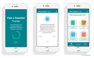
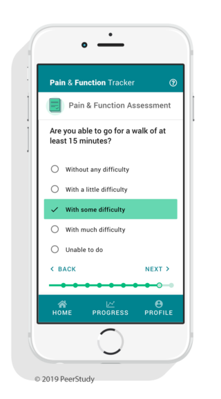
In addition to leading with a mobile application strategy, another goal of the redesign was to make it more approachable. The existing application inundated users with medical jargon, required too many steps, and included an overwhelming amount of information to wade through. As a result, filling out a survey could take patients a long time and this led to frustration and task abandonment. Our objective was to distill the survey down to a small number of questions and streamline the workflows and interactions.
One of the goals that the surgeon has in his field of practice is giving his patients realistic expectations. When surgical intervention isn’t necessary, patients need to know there are alternatives. So, we included alternative treatments and recommendations, either before the surgery or in place of the surgery — such as yoga, meditation, or over the counter pain medications.
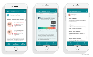
The new application prototype segmented the user flows into small, more consumable sections and incorporated simple, supporting illustrations for a more streamlined experience y. We also redesigned how the pain and function survey results were displayed, or what was called the “sum number.” The number from the original survey lacked context and meaning to users. “What does 74 mean?” was a common sentiment. Was 74 good? Was it bad? We created custom data visualizations similar to what you would see on a Fitbit to show at a glance how that user compared to others in their age group.
Implications for UX for aging users
The results of our redesigned prototype testing showed:
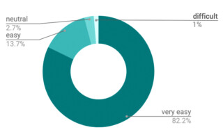
- 82.2% of users indicated that the application was very easy to use
- 1% indicated that it was difficult to use
- 91.8% had no trouble understanding the graphics and the scores
“The app wasn’t hard to use, or to read and the look was very nice, neat, and had a good feel to it as well.” — remote usability test participant
“The app was clean, graphs were very legible and easy to read, and the app was easy to navigate.” — remote usability test participant
With a user age group of 65+, we wanted to make sure the design included larger text (nothing below 16px), plenty of contrast, and a friendly, approachable tone. Most of all, we wanted the app to be an empowering and positive experience for the users. The visual challenge of balancing these aspects while providing high value to both the patient and their doctor pushed our design team to innovate.
We look forward to this application becoming a mainstream tool for patients and think it’s an excellent example of designing a user experience specifically for an aging population.
Have questions? We’d be happy to chat about this project or others. Contact us at info@limina.co
Originally published in UX News.
If you are interested in reading more about designing for current societal challenges, specifically those related to COVID-19, feel free to read Designing for the New Normal by Limina Co-founder Jon Fukuda.