Blood, Sweat, and Style Tiles: A Statebook Revamp
How Style Tiles can speed up your Design Process
by Cecily Mullen
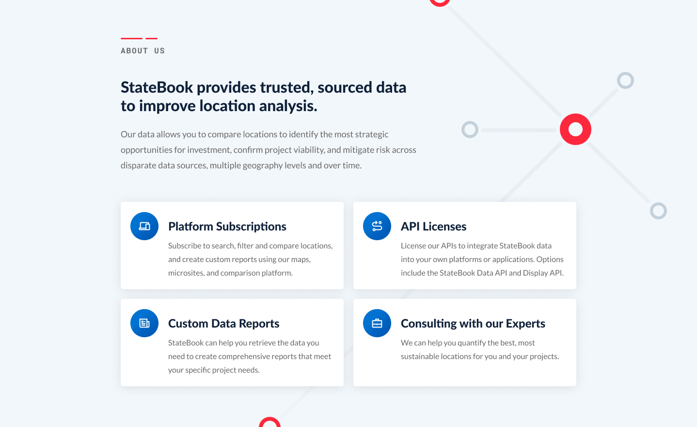
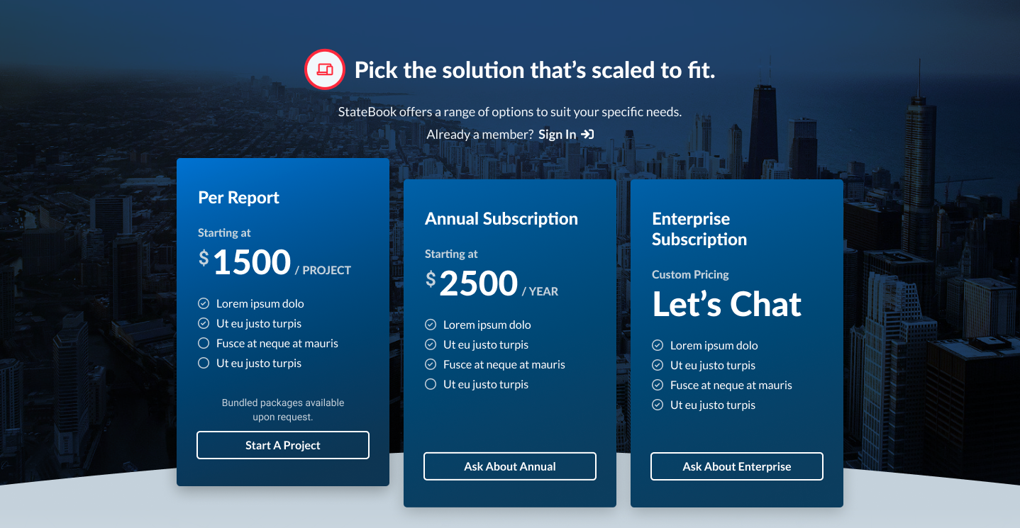
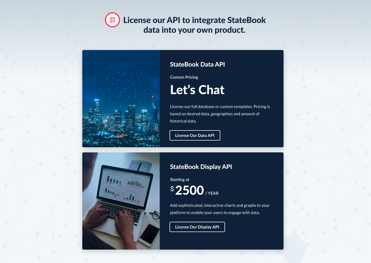
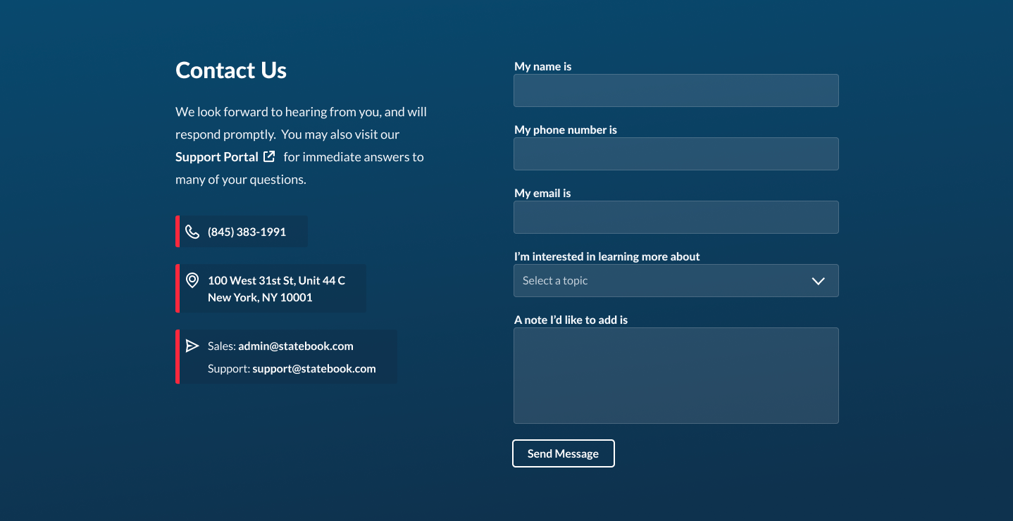
StateBook provides comprehensive economic market data for every community in the U.S. Earlier this year, their team came to Limina with a design problem. Their goal was to reposition their offering and their brand through a home page redesign. They had a strong grasp of the content and communication goals for a new home page, but only a basic idea of how to attack the design. The project was narrow on both scope and time; they needed a partner to bring their new vision to life, and they needed it yesterday.

Rapid Planning and a side of Style Tiles
With business goals in hand, our team came together in front of the whiteboard and traced the content goals of the page from top to bottom. We looked to other sites for layout and design inspiration, including a shortlist of websites the Statebook team liked.
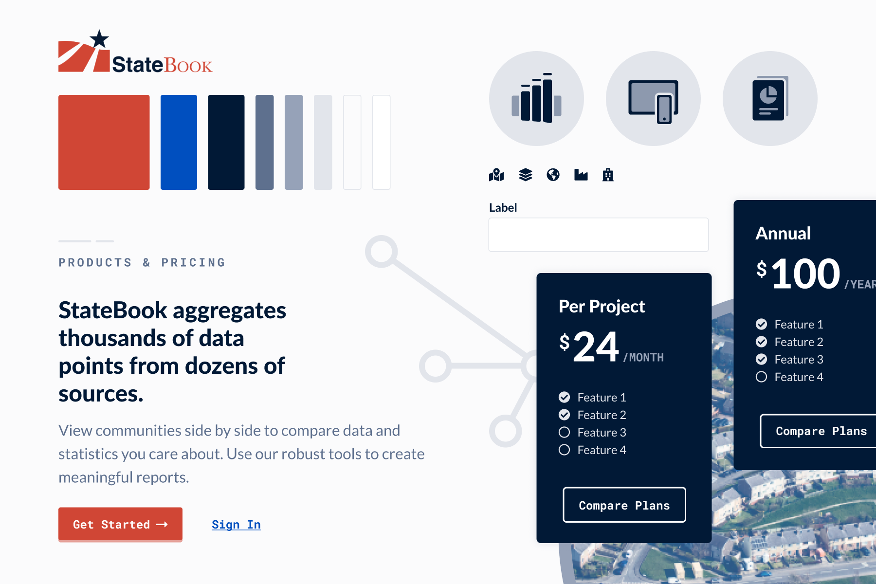
To kickstart the visual design we started with the basics. In order to get the general look and feel agreed upon, we created two style tiles that included color palettes, fonts, and user interface (UI) stylistic choices to give Statebook a choice in visual direction. These relied on inputs from the current brand but allowed for an expansion into other colors, fonts, and styles to modernize Statebook’s digital presence.
Ellie, fellow Limina designer, and I created distinct, yet cohesive options for Statebook to evolve the current brand. In our initial review, the team liked elements of both style tiles, resulting in a hybrid visual direction for the mockups.

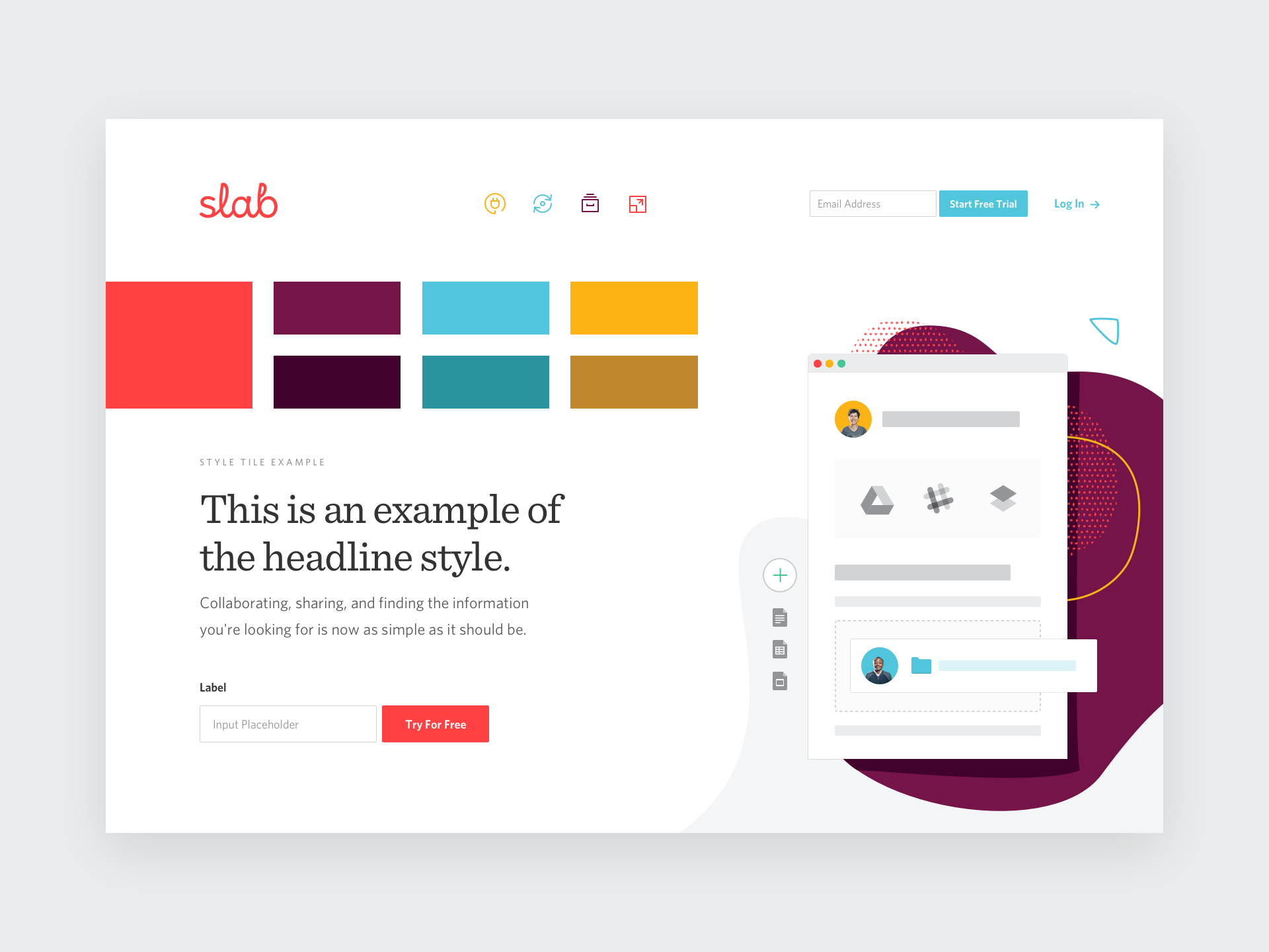
What's a Style Tile?
In web design, a style tile is a tool to help designers communicate a visual style direction by bringing a few foundational web elements together. Typically those elements include:
- The color palette, identifying primary colors, secondary colors, and any additional color dimensions.
- Typography structure, including examples like headlines, body copy, and labels.
- Sample user interface elements, like buttons, cards, form fields, and iconography.
Style tiles have been described as the intermediary step between a mood board and a full-on detailed mockup. They allow designers to get feedback and stakeholder buy-in on a visual system earlier in the review cycle before too much time has been invested in visual composites.
Collaboration for the Win
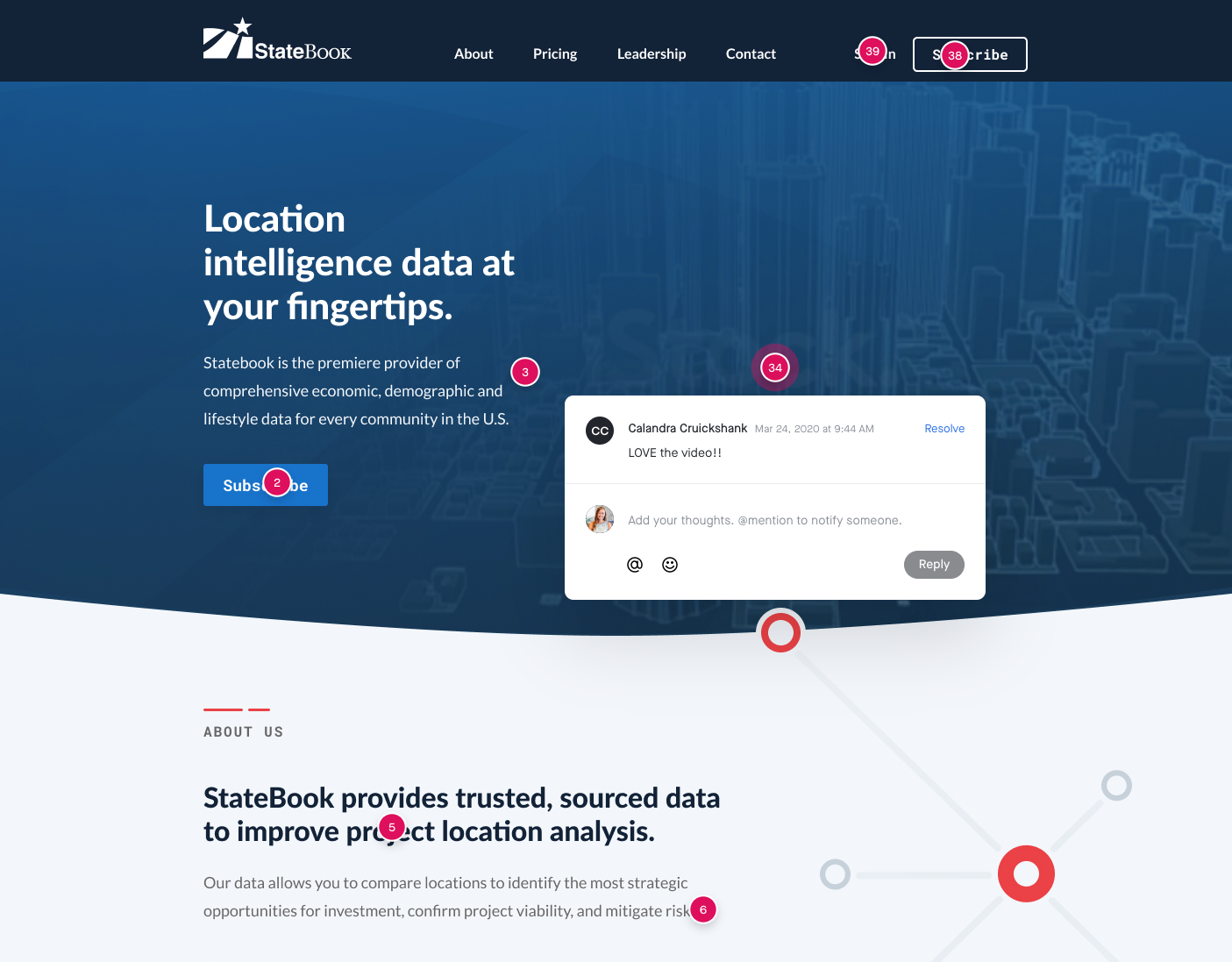
With the hybrid style in mind, and with some of the UI elements fully agreed upon from the very beginning, visual composites (also known as comps) came together extremely quickly. This was also due to our team’s choices in collaboration tools. The style tiles were created in Figma. As we moved into the composite stage, we stayed within Figma which allowed us to quickly move from the tile to the comp, grabbing our styles and implementing them on the page. Many times we found ourselves sitting together–sometimes even silently–on a Slack call as we watched each other work together live on the same page.
That collaboration didn’t just occur internally, but with Statebook as well. We allowed the Statebook team to provide comments on an InVision prototype for quick back and forth commentary on content and layout.
More than just a Pretty Comp
With only minor edits and content updates in the initial review, the second and final iteration of the home page design fully captured the content goals for Statebook’s new digital face.
Along with the composite, Jon Fukuda plugged away on the front-end to hand off to Statebook IT. Because there was visual styling consensus early on in the project through the style tiles, he was able to craft the CSS, page layouts, and component styling before the designs were fully finished and approved. This was invaluable when it came to finessing the responsive mobile views of the home page; instead of mocking up the mobile version of the page, we tweaked live code on the fly.
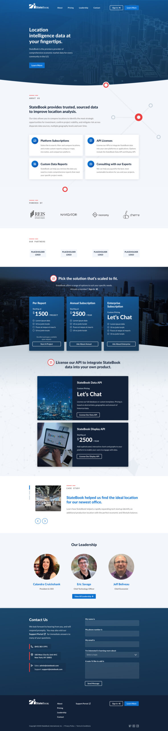
From start to delivery, the team executed this project within a few weeks. Statebook was ecstatic with the outcome. While this effort was localized to the home page, Statebook’s IT team has been slowly implementing complementary styles on their existing pages throughout their system, and even on their product’s platform.
“Limina worked with us to completely refresh the look and feel of our home page design at Statebook.com. The team is excited about our project and provided an efficient, professional turnaround and a creative, fresh design. We’re thrilled with the results and look forward to collaborating with them on additional projects in the very near future.”
— Calandra Cruickshank, President and CEO of StateBook International
“Limina designed and developed our new website front end, and we are thrilled! The fresh visuals and creative design are so much more engaging, and the professional and interactive user experience is just what we needed. Our customers love it! We look forward to partnering with the Limina team on our next project.”
— Eric Savage, Chief Technology Officer of StateBook International
The Limina team has been so happy to be partnering with the Statebook team on their new home page launch, and look forward to helping them more in their future endeavors