Good vs. Evil UX Design
by Ellie Krysl & Danielle Eck
We all probably think we know what good design is (after all, design and the concept of user experience has become a fairly mainstream addition to our vernacular), but the renowned Don Norman probably sums it up best:
“Good design is actually a lot harder to notice than poor design, in part because good designs fit our needs so well that the design is invisible.”- Don Norman, Author of The Design of Everyday Things
And while we notice poor design as impeding ease of use, what exactly makes design go from bad to evil?
Here are the key takeaways from a talk given by two of our UX experts, Ellie Krysl and Danielle Eck.
What makes a design good?
According to UX Collective,
“Good design is one that fills the gap between business goals and user needs. In order to fill this gap, a process must be followed. A process that takes into consideration best practices of user experience (UX) and usability guidelines to produce the desired outcome. Good design is one that is tailored for the human use, and not one that is only functional or usable. A good designer knows how to get into the mindset of his users, and turns their needs into a meaningful, desirable, and easy-to-use product or service.”
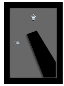
The term “user experience” was coined in the 1990s, but UX as a concept has been around since some of humanity’s earliest inventions. Here is a great example of good design found in an everyday object. Like Don mentioned in his quote, most of us probably haven’t given much thought to the hook options on the back of a picture frame because the solution fits our need; you can hang it vertically or horizontally depending on your photo.
At Limina, the problems we tackle are considerably more complex. We focus on simplifying complicated web, mobile, and computer interactions, and creating usable applications and systems, but the same basic principles of the photo frame hold true. With good design, the actions you take have predictable and desired outcomes.
Jakob Nielsen, one of the founders of the Nielsen Norman Group, advocates 10 General Principles for Interaction Design. These are excellent guidelines for designers to ensure the usability of their creations are both good and consistent:
- Visibility of system status.
- Match between system and the real world.
- User control and freedom.
- Consistency and standards.
- Error prevention.
- Recognition rather than recall.
- Flexibility and efficiency of use.
- Aesthetic and minimalist design.
- Error recovery.
- Help and documentation.
What makes design bad?
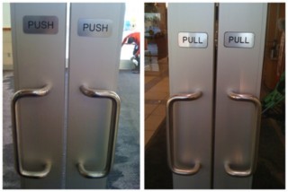
Bad design usually comes from lack of knowledge or poor discovery. It is unintentionally bad, such as the so-called “Norman door” which confuses or fails to give you an idea whether to push or pull. (The term is named after Don Norman, quoted above. Check out this humorous Vox video on Norman doors including an interview with Don Norman.)
Bad design is characterized by anti-patterns, including:
- Doesn’t Work
- Counter-productive
- Plain bad design
- Poorly executed
- Easily identified metrics
- Never intentional
If you think you might have some of these anti-patterns on your website, the best way to find out is to turn to your web metrics. Look for users dropping off pages, random clicking, or repeatedly scrolling up and down. Bad website or app design would include a hover-over menu that closes before you can click a menu item, clickable elements that don’t appear clickable, or erasing information in a form when there’s an error.
What makes design evil?
Evil design, on the other hand, is intentionally bad and dishonest design. It uses trickery to get users to go down the path that is desired for the company, not the user. These evil design tricks are known as dark patterns. Dark patterns use interfaces or interactions purposely designed in a way that tricks users into agreeing, sharing, purchasing or signing up for things that they didn’t mean to.
Common characteristics of dark patterns include:
- Works… in its own way
- Productive for one party
- Exploits human weaknesses
- Carefully crafted
- Difficult to identify
There are several different types of dark patterns, including bait and switch, “confirmshaming,” and misdirection.

Windows became famous for creating the bait and switch modal. In this example, the “upgrade now,” “OK,” and “X” buttons all automatically started the upgrade. There was no getting out of it.

Confirmshaming uses passive-aggressive statements to guilt users into opting in to something. In this example, the option to decline is worded to shame cat lovers into compliance.
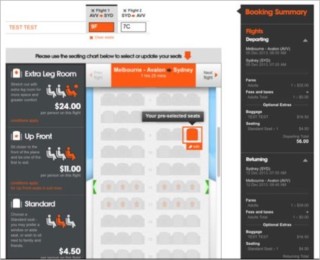
With misdirection, the design purposefully focuses your attention on one thing in order to distract your attention from another. This airline website automatically selects a premium seat for you that costs extra money. The user can avoid the charge by selecting “skip” to select a free seat, but most users would assume their only choice is the preselected seat.
Once you start noticing them, you realize the prevalence of evil design, including adding last minute items (such as a warranty) into your online shopping cart, and tricking you into publicly sharing personal information on sites like Facebook.
At Limina, we help companies implement good design. In fact, we strive to go beyond good, to noble design: creating memorable experiences that have personal significance for the user … but that’s a topic for another post!
We hope this was informative and useful – view our Design for Good or Evil presentation if you’d like to learn more.