Hello SBA. We want to help you.
This Everyday UX post is dedicated to an important Government business development tool brought to you by the U.S. Small Business Administration. We’d like to highlight some UX and technical issues with tool while demonstrating some UX enhancements through applying U.S. Digital Service & 18F’s Web Design Standards. Search and data-mining tools have come a long way over the years. Some critical milestones are marked by a widespread adoption of AJAX (asynchronous JavaScript and XML) and the publication of Luke Wroblewski’s “Web Form Design” where he addresses the need for a higher degree of emphasis on Web Form usability and UI optimization.
We’ll briefly cover a subset of the issues we’ve run into the SBA’s DSBS – of which there are too many to cover in this post – and then demonstrate the UX enhancements that can remedy the issues while showcasing a hypothetical implementation of the USDS Web Standards.
Our Observation
Instead of showing all the fields with explanation of how they should work just make the fields “smart” by leveraging progressive disclosure
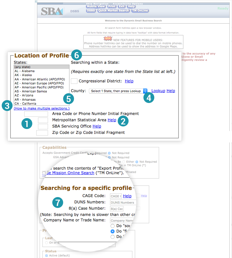
The majority of the “Help” links are broken or directs the user to an external page that is also broken. Help page/doc is extremely long, wordy and not contextual
The information organization and how the tool works currently requires too much explanation
UI controls are out of date - not taking advantage of contemporary interaction patterns - using outdated patterns that require a unecessary amount of explanation
Layout is cluttered and confusing - hierarchy and relationship between objects w/ in the group box is unclear
Section name is difficult to understand - should just be “Location”
Call to action, “Search” is at bottom of page and is hidden - should be in view all the time
Name search doesn’t pulls up “no results,” but using DUNs number finds company
Our Solution
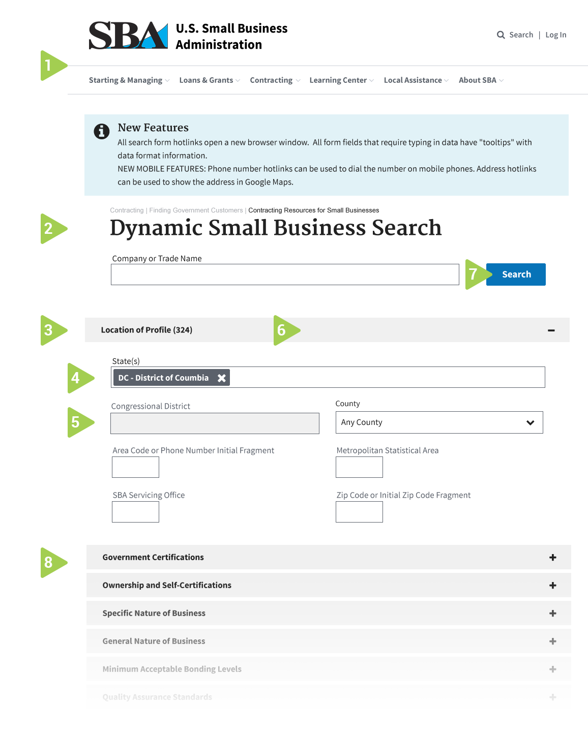
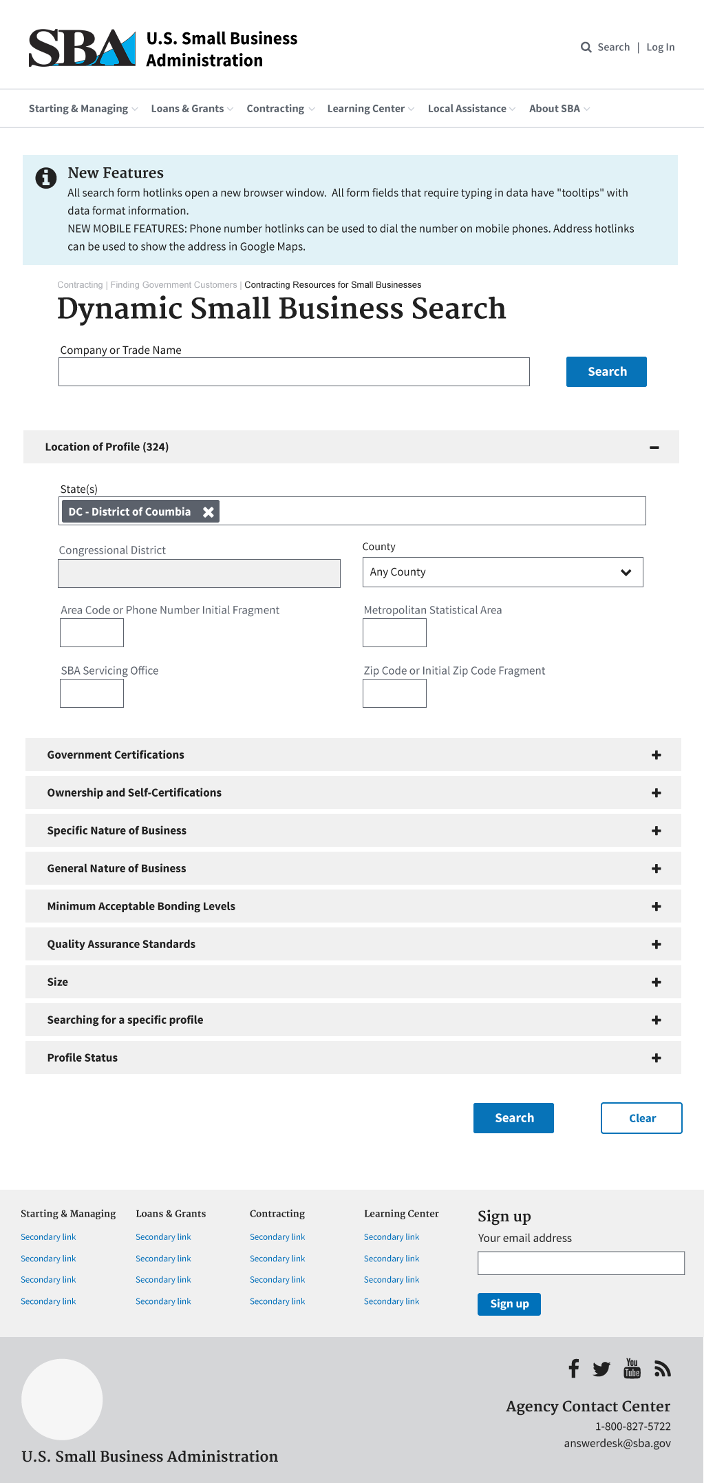
We used the U.S. Digital Services Government UI Standards to revise the look and feel of the DSBS. This gives a clean and contemporary UI spec for updating the search capability. The revised layout also assumes responsive templates to handle all mobile considerations.
The DSBS should support simple look up, as well as advanced exploratory query.
For this exercise, we have only demonstrated how to clean up the Location Profile section.
Leveraging a contemporary form element like “Chosen” by Harvest would eliminate the need for lengthy pro-tip descriptions of how to multi-select options.
Asynchronous forms make data entry more user-friendly by giving the user a better understanding of field relationships, interactivity, and underlying data. In this example, the District of Columbia has no Congressional Districts - so the field remains disabled.
Giving users feedback on the impact their query parameters have on the result count could be helpful.
On the current form the search button is buried at the bottom of the page - placement both at the top and bottom of the form would be helpful.
The use of accordion UI to manage the field sets can help minimize the visual clutter and keep the users’ search more focused.
We know the SBA has it’s hands full supporting 29 million small business across the country, including us. We want the technologists and managers of SBA tools to know that we support your cause. We hope this little post helps spur some inspiration to bring more innovation and UX enhancement across the agency!
Get involved in our Everyday UX! Share your UX hangups. We’ll take a look and see if we can come up with a fix.