The Research is in: Hamburger Menus are OUT, and Taco Menus are the New Standard in Usability
by Limina
Limina is weighing in on the age-old debate of whether to use a hamburger icon (three horizontal lines) to represent a collapsed navigation menu. Other systems use three vertical dots or simply the word “menu”, but in the past year, Limina has worked to develop a new solution that surpasses them all in usability: the taco nav.
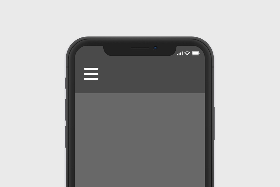
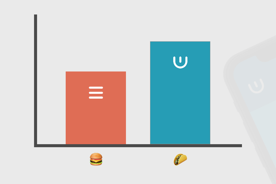
The traditional hamburger menu navigation.
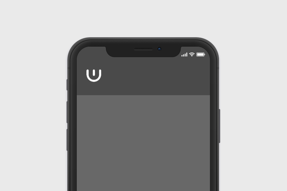
The all-new taco menu navigation.
The Problem
In working on a Drupal CMS project, Limina Designers Ellie Krysl, Lisa Hilmes and Cecily Mullen found problems using a hamburger menu button to represent the navigation successfully on mobile devices, but that the word “menu” would not fit in the space provided while still meeting WCAG AA standards of readability. In looking to tried and true UX design resources, they found O’Reilly’s “Articulating Design Decisions” that suggested “taking the hamburger off the menu” based on best-practice research. Armed with this knowledge, they set out on a mission to find a new, enticingly-clickable form to takeover for the traditional three-horizontal-lined hamburger nav.
“In a world where we are still using floppy discs for ‘save’ and landline-telephones for ‘call’ or ‘contact’, we really felt this was an opportunity to define a new icon before the industry adopts a sub-status-quo icon for one of the most important symbols used on many mobile sites and applications worldwide,” said Lisa Hilmes, interaction designer of Limina.
The Hunt for a Better Image
As with all UX problems, we begin with problem exploration and qualitative research. We collected landing page interfaces from 30 of the most popular and renowned websites and tested their existing navigation patterns. Among the 30 sites, we found 12 unique menu styles and 6 different menu placements. We brought in 60 average mobile internet users and asked them to pull up each of the sites on their own smartphone and asked them to navigate to specific lower-level pages in the site, changing the order of the sites for each user. We found that the sites that used the hamburger nav icon tended to underperform* compared to other sites. Even less successful were sites that used their own company logo as the menu icon. The sites that performed the best were those that used the word “menu”, with the exception of a restaurant website which used the label “menu,” but it took them to the actual menu of food items and not a list of subpages. Other high performers were sites that had so few pages, they required no menu at all. We knew this solution would not work for every site, especially large-scale sites with many-tiered navigation levels.
We also took a set of the common menu icons, including the three horizontal lines icon, the three vertical dots icon, and a downward facing chevron arrow, and we asked each user what that symbol meant to them.
Lastly, we asked users about what they need out of mobile site navigation, and how important it was for them. We received feedback such as:
- “I don’t waste my time with landing pages. I want either the menu or the search bar right away because I already know what I want from the site.”
- “I need an icon that looks like it’s holding a treasure trove of content–not an equals sign that grew an extra line.”
- “I usually ignore those three lines because they don’t mean anything to me.”
After analyzing our results, we came up with our hypothesis. It was clear to us that there was a need for a universal symbol that could be used instead of a company’s logo, but it needed to be more specialized than the hamburger nav, which could have many other meanings such as “list,” “content,” “fully justified text,” or “boring thing I see everywhere but don’t understand.” We went to the drawing board and came up with 100 different ideas for symbols, and tested each until we narrowed it down to the best option, what we call the taco nav.
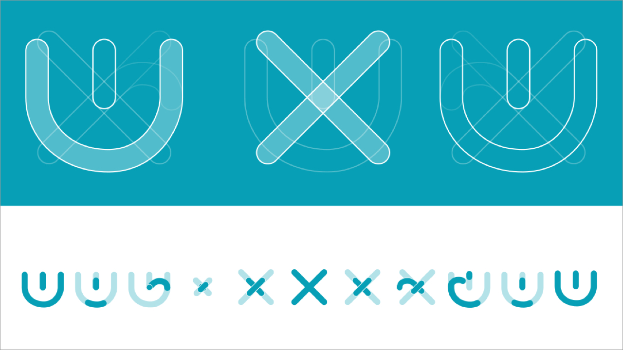
A behind the scenes look at how Limina designers created the taco nav.
Order Up
Reasons why the taco nav icon is the strongest solution:
- We explored many options, but the one we landed on came out on top because it didn’t have any preexisting meanings associated to it.
- We wanted a button that would entice more people to hit the button and see the menu. We found in our user testing that an overwhelming majority of users we interviewed wanted to click on the taco. We subsequently found that a majority of users preferred tacos to hamburgers. One user noted, “It’s much easier to find a naturally gluten-free taco than it is to find a gluten-free burger, so I will always choose taco over burger.”
- We wanted the icon to convey a container that could hold “stuff” (ie, links, resources, the “meat” of the site). The concept of a shell represented this better than a bun, which you can’t really distinguish from the “meat” in the hamburger menu icon.
Conclusion
While we couldn’t present our full research study and findings in this blog post, we realize UX practitioners may be wondering if inventing a whole new symbol from scratch and applying it ubiquitously across projects is a good thing. And you would be right. As it is April Fools day, we totally got you! We just made the whole thing up, and we definitely DO NOT recommend UX designers start adopting the Taco Nav. Though there definitely are issues with the commonly used Hamburger Nav. The Taco Nav is pretty cute, though, right?
#taconav, #AprilFoolsDay, #InternationalFunatWorkDay