Tools to Help with Web Content Accessibility Guidelines (WCAG) and Requirements
by Ellie Krysl
“When we design for the extremes, everybody benefits,” explains eAccessibility and Inclusive Design expert David Berman. This is so true. In this short video, Berman discusses why Web Accessibility Matters and includes a fascinating history on inventions that were initially developed for people with disabilities that later lead to innovations that benefitted the masses. For example, video captions were originally designed for people who are deaf or have some level of hearing loss. But did you know that 85% of Facebook videos are watched without sound — and greatly by users who do not have hearing loss? Many people prefer to watch videos without the audio, especially when they are commuting on public transportation or when they are in loud environments where the audio cannot be heard. This is a great example of how web accessibility features benefit everyone.
In my previous blog, Integrating WCAG and Accessibility into your Company’s Digital Experiences, I answer common questions and approaches to help you and your company achieve a clearer understanding of the data and compliance guidelines, how to address them and the associated legal requirements. This blog addresses the UX skills required to ensure accessibility, who’s responsible for WCAG compliance, and the available tools to help.
Is your UX team ready to address accessibility requirements?
Once your company decides to ensure accessibility, having the right mix of expertise, skills and talented resources will be essential. Industry expert Jared Spool predicts, “In the short term, we’ll likely see a higher demand for UX professionals with specialized knowledge in accessibility. In the long term, this knowledge will be required for all UX professionals.”
At Limina, WCAG is a core competency. We think about accessibility and build it into every project we work on. If a client has not thought about accessibility, we’ll initiate the conversation so that it can be addressed up front, rather than being an afterthought.
The WUHCAG Web accessibility for developers site has an extremely helpful WCAG checklist as well as clear descriptions of what designers, developers, and content creators can do to meet each requirement. Once your company defines its accessibility goals, the next step is to develop a plan to reach them. I recommend addressing accessibility requirements as early in the design process as possible.
At Limina, we’ve created a workbook that outlines:
- each guideline as a requirement,
- the ways in which to meet that requirement,
- at what stage in the design process it can be met, and
- the person or team responsible for meeting that requirement.
Who’s responsible for compliance?
A question that is often raised in accessibility discussions is, who is responsible for web content accessibility compliance? Is it something that should be addressed during wireframing? Does it need to be part of the high-fidelity user interface? Or can it only be met during development?
A cross-functional, multi-disciplinary team is the answer. Visual designers can check the contrast ratios and provide the correct text size and spacing as part of the base styles. Developers can ensure there are input areas for captions or transcripts and alt tags for images. But that only provides the place for the content and ensures that the content is formatted correctly. It’s up to the content creators to actually enter these items — or else you’re still not meeting the requirements. In some cases, the accessibility requirements can only be addressed by the content creators, which could mean a client rather than the UX designers or developers will be responsible for meeting that guideline. That’s why Limina’s process includes educating and supporting our clients around the accessibility guidelines they will be responsible for, making sure the final product or site is as extensible as possible.
Tools for WCAG
There are many tools and application plugins that can simulate different forms of colorblindness, check contrast ratios and test text sizes to aid UX specialists along the way in meeting the WCAG requirements. However, as mentioned above not all requirements can be met at the visual design phase. Interaction designers, developers, even content creators have tools and techniques available to help them meet accessibility guidelines at different stages of a project.
Much of my work focuses on design systems creation and management, including large user interface (UI) libraries, most of which are custom. Here are just a few tools I use regularly.

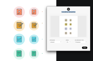
This plugin not only has a contrast tester for text over background color (FYI, it doesn’t work over gradients or transparent overlays), but it also includes a colorblind simulator with options to view your designs through multiple types of colorblindness.

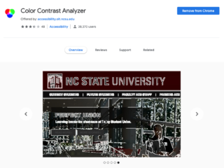
The Color Contrast Analyzer Chrome extension
Color Contrast Analyzer
Analyze a web page or portion of a web page for conformance with WCAG 2.0 Color Contrast requirements.
This one can be a little quirky at times, but it does allow designers to check the contrast of text over gradients or partially transparent (think overlays or scrims) backgrounds.

The United States Web Design System (USWDS) by the GSA
USWDS: The United States Web Design System
The .gov means it’s official. Federal government websites often end in .gov or .mil. Before sharing sensitive information, make sure you’re on a federal government site. The site is secure. The https:// ensures that you are connecting to the official website and that any information you provide is encrypted and transmitted securely.
If you are creating a government site, the USWDS is the best place to start. They have a large, downloadable UI component library that meets WCAG 2.0 AA accessibility guidelines and conforms to the standards of Section 508 of the Rehabilitation Act. There is a ton of documentation and support provided, as well as a full history of the project originally started by 18F and the U.S. Digital Service in 2015. It’s currently on version 2.0.3 and a valuable resource if you are creating a government or non-government site. I have personally used this library as a base for a large federal website redesign that will go live later this year.
Tools don’t replace user testing
There are so many other great tools and resources out there and I invite you to include your recommendations in the comments. That said, tools and simulators like the ones mentioned above are great to use while designing, but they cannot take the place of true user testing — an incredibly important and extensive topic for another day.
Interested in learning more? Read the first post in the series.
Nothing found.