The Importance of a Solid Content Outline in UX Design
by Lisa Hilmes
If you’re browsing a website, intranet, or mobile app and you can’t find what you are looking for within a matter of seconds, you will leave the page – it doesn’t matter how nice it looks, or how easy it is to navigate.
UX designers tend to put most of their focus on ease of use and good graphic design, but the content is the third piece of the puzzle that is ultimately necessary for users to find value in your product.
In 2019, I presented at the UX Burlington conference about how content outlines help users find the value in your webpage so they don’t immediately give up on your site or product. The conference focused on UX in the Age of Immediacy because today’s user expectations are changing fast, and real-time interactions have helped fuel those shifts. For UX designers, this means we must demonstrate value in seconds—or, at best, prove usefulness on first use.
As visual people, it’s typical for designers to want to jump right into prototyping, but there’s really a lot of thinking that needs to be done before that happens. Often, this is an informal process, but content outlining as a practice formalizes a plan of what needs to go into a page or an application before you start drawing it out. Think of a content outline as a more detailed information architecture of an individual page—it’s a plan for what should be included on the page, in what hierarchy, and where you can go from there.
The following are some highlights from my presentation titled, “A Valuable Experience Begins with a Solid Content Outline.” If you missed the conference, I’ve included a link to my slides at the end of this post.
Why content outlining?
Content outlining sets your wireframe up for success by giving it the appropriate content the user is looking for. It also sets up successful collaboration between the design team and the technical team. If you’ve taken the time to construct a solid content outline, you’ll already have a prescription of all the things you need to include on the page that is approved by the technical team, it speeds up your wireframing and reduces rework that typically occurs from holding technical discussions after the fact.
How do you decide what goes on the page?
Start with a journalistic mindset, asking questions like “Who is using the page?”, “What do they need to find there?”, and “Why is it important?”. These questions will give you the information you need to determine what should go on each page.
You can also employ empathy by putting yourself in your user’s shoes and imagining how you would expect the page to be. This can help you form a narrative to determine what content should be included and to define the user’s logical order of operations. You should also turn to existing resources such as an information architecture diagram, competitive analysis, the current product, project requirements, and user research.
What order, or hierarchy, works best?
Go back to when you stepped into your users’ shoes. Ask yourself what content should have the most prominence on the page. Likely this will go near the top or take up the most space. Use the narrative you crafted to determine a logical ordering of content by what the user expects and when.
However, nothing you decide now is set in stone—when content turns to visual, it becomes clearer what should be seen first vs. last. Also, remember, this is only a hypothesis, and like all hypotheses, it must be tested.
Handling page templates and layouts
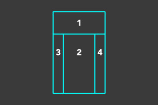
There are four primary areas on a screen (excluding the main navigation and the footer). They are the hero area (optional large image area at the top), the body (required), and optional left and right columns.
In a content outline, you should define what layout each page should use and where on the page each piece of content should sit.

What level of detail should you use in your writing?
Think of your content outline like writing the outline for an article or writing a grocery list. You are not writing the content for the entire page. You are defining what types of content should go into the page, when you need headers and descriptions, or when instructive text is needed for a button or interaction.
What does a content outline look like?
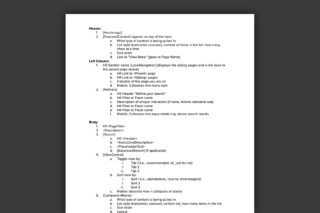
Here’s a sample content outline to show what they look like. Of course, each one is different. This one shows the name (page title), description, content, call to action, and off-ramps (how you leave the page).

Managing Content Outlines
Content outlines can be stand-alone (Google doc, Confluence, Airtable, Coda, or Notion) or ported into your Figma/Sketch files alongside your page or component frames/canvas.
The future of UX content outlines is in the markup; if you build canonical models for labels, naming conventions, and taxonomies, you design documentation (Jira, Airtable, pick your SST). Then, extending the UX outline markup into your design management framework across tools and teams becomes possible; think of this as Object-Oriented UX (OOUX) lite. The power and capacity to build design intelligence are in the relationship models you create to support and harness this markup.
Conclusion
The next time you are tasked with creating a wireframe, first consider if there is an existing content outline you can work from, or perhaps you should be the person to create it.
Remember that the most important thing is for a user to see what they need on the page, or they will immediately leave and look for something more relevant.
View the full presentation
Slides presented by Lisa Hilmes at UX Burlington: “A valuable experience begins with a solid content outline”https://www.slideshare.net/LiminaUX/a-valuable-experience-begins-with-a-solid-content-outline


Interested in how Limina manages UX knowledge?
Read our design planning and management whitepaper that outlines various types of design information organizations struggle to continuously integrate for delivering research and design at scale. Our model allows digital product teams to better organize and integrate research and design into continuous integration product lifecycles.