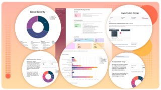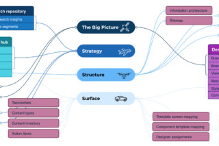
We leverage our research to understand users, identify issues, generate insights, and develop strategies. We then create reusable, richly tagged repositories that allow you to trace recommendations or requirements back to the original research inputs on which they were based.
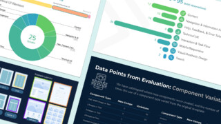
In a UX eval, our team examines the current state of an existing user interface, evaluating it against established UX heuristics and best practices. The evaluation covers several perspectives, including the look and feel, screen workflows, interactions, content, and digital accessibility and usability. An eval can even look at ways to optimize the assets behind the user interface (UI), like templates, components, and libraries. Improving the user experience of a UI means understanding the current state, where it needs to go, and how to connect the dots in between.
Areas of Expertise
We evaluate the usability and effectiveness of the product screens or page templates against a series of UX best practices. Findings address three design perspectives: visual, usability, and interaction, and could include comparisons to competitor sites.
Workflow
- Clear conceptual modeling
- Clear and efficient workflow
- Facilitation of exploration
- Access to relevant help
- Flexibility and efficiency of use
- Error and confirmation messaging
- Support of rapid learnability
Interaction
- Navigation modeling
- Appropriate use of interface controls
- Contextual relevance of info or tools
- Use of data visualization
- Use of defaults
- Appropriate interaction models
Look & Feel
- Consistency of layout and organization
- Appropriate information presentation
- Effective information hierarchy
- Effective use of visual elements
- Consistent language and terminology
- Accessibility assessment (WCAG)
Targeted support
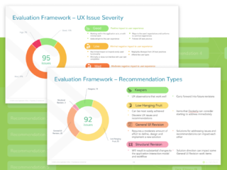
- Issues: Categorized, tagged, & ranked
- Recommendations: Heuristics, best practices, & design effort rating
- Highly-visual and interactive reports
- UX glossary
Extended coverage
Comprehensive analysis
Looking for a different approach?
Packages aren't for everyone. If you need an even more focused evaluation, have a more complex product, or want to cover multiple breakpoints or platforms, No problem! We can create a custom package based on your specific needs.
Featured Work
Avid
Website UX evaluation
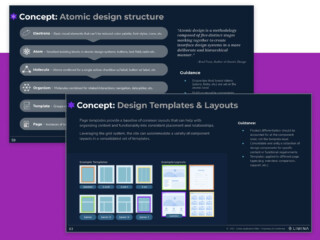
Conducted a targeted evaluation focused on reviewing specific workflows and screens against industry best practices and competitors. Outputs included prioritized recommendations and a plan for how to apply them
Docketly
Application UX evaluation
Defining a prioritized set of strategic usability improvement recommendations to advance the interactive experience for multiple user types of an industry-leading legal services platform.
Related Insights
Related Services

User Interface (UI) Design

Design System Creation and Optimization

Information Architecture Design

Content Architecture

UX Srategy


